Amazing Web Designs That Stand Out From The Rest
Feb 28, 2025

Let's be honest…. Most websites these days look practically identical. You know the type: static, templated…. and honestly…. kinda boring! The kind that makes you want to yawn halfway through browsing them. They follow the same predictable patterns with similar layouts, fonts and design elements.
Then on the complete opposite end of the spectrum, you have those websites that are so flashy and over-animated that they're practically seizure-inducing. They're trying so hard to be different that they've sacrificed usability in the process.
But what if there was a happy medium? Beautiful websites that don't look like every other templated site out there. But also don't overwhelm you with pointless and over-the-top animations. Websites that add fun and engaging elements like awesome illustrations or cool animations while still maintaining great user experience.
So let's explore 5 websites that are clever, creative and definitely WOW-worthy! But in the sense, they don't overwhelm you with pointless and over-the-top animations. These sites strike that perfect balance between uniqueness and usability.
Now if you're more of a visual learn, feel free to watch my breakdown on Youtube:
Otherwise, please continue reading…
1. Seasoned Koto Studio
Seasoned Koto Studio is a brand agency with a site that really demonstrates the power of novelty. And let's face it, people crave novelty these days. I know I do!
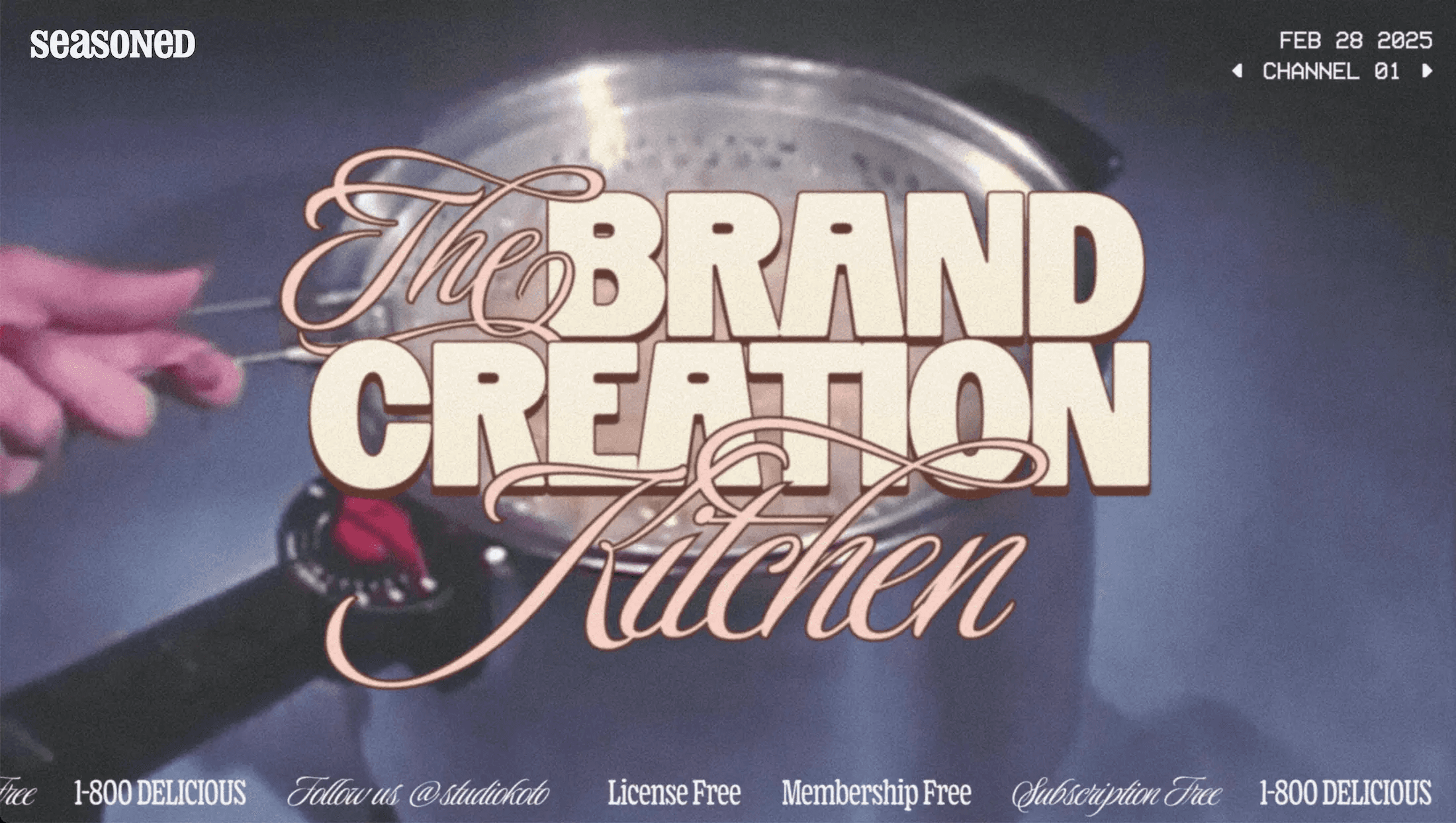
What makes this site special is their commitment to a retro cooking theme that they've cleverly tied to their brand strategy services. You might be thinking, "Retro cooking and brand strategy? How does that work together?" But trust me, their out-of-the-box approach just works beautifully.
The site uses old-style typography paired with background footage of vintage cooking techniques. They brilliantly merge retro aesthetics with modern UX practices, like incorporating a scrolling text banner that highlights keywords they want to emphasize. There's even a subtle noise effect in the background that enhances the retro theme - reminiscent of that grainy quality you'd see in TV shows from the 70s, 80s and 90s.
As you scroll down, the typography continues to reinforce the retro theme, along with perfectly selected colors that evoke nostalgia. It immediately brings to mind those old cookbooks my mom used to have, creating an instant emotional connection.
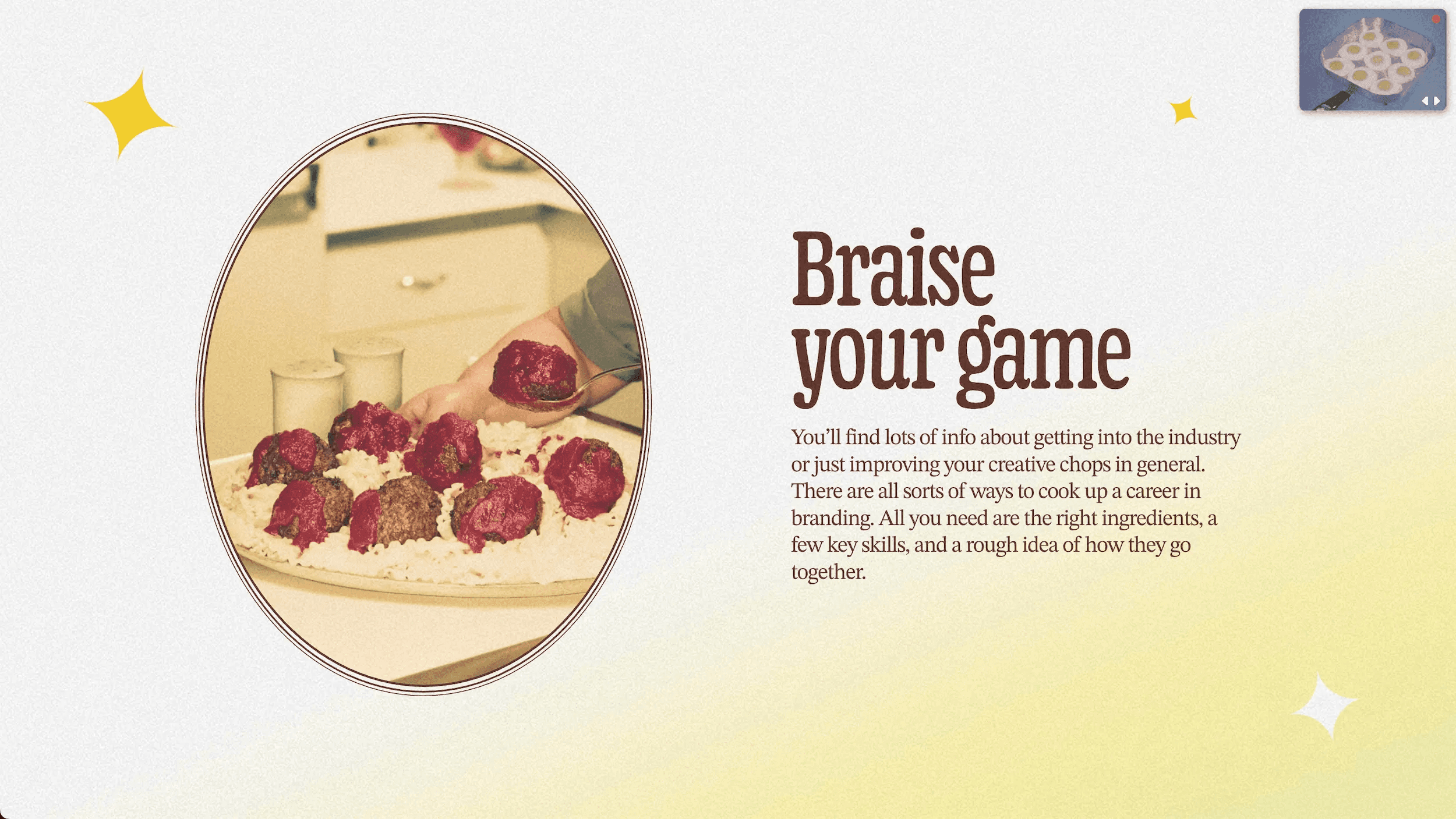
One of the most ingenious elements is how they've integrated their service offerings into this cookbook theme. They've created clickable sections with headings like "Start with Strategy" and "The Power of Good Ideas" that function as recipe pages in this virtual cookbook.

They've even incorporated an old-style toaster with the message "Pop Back Anytime" and “See You" burned into the toast itself.
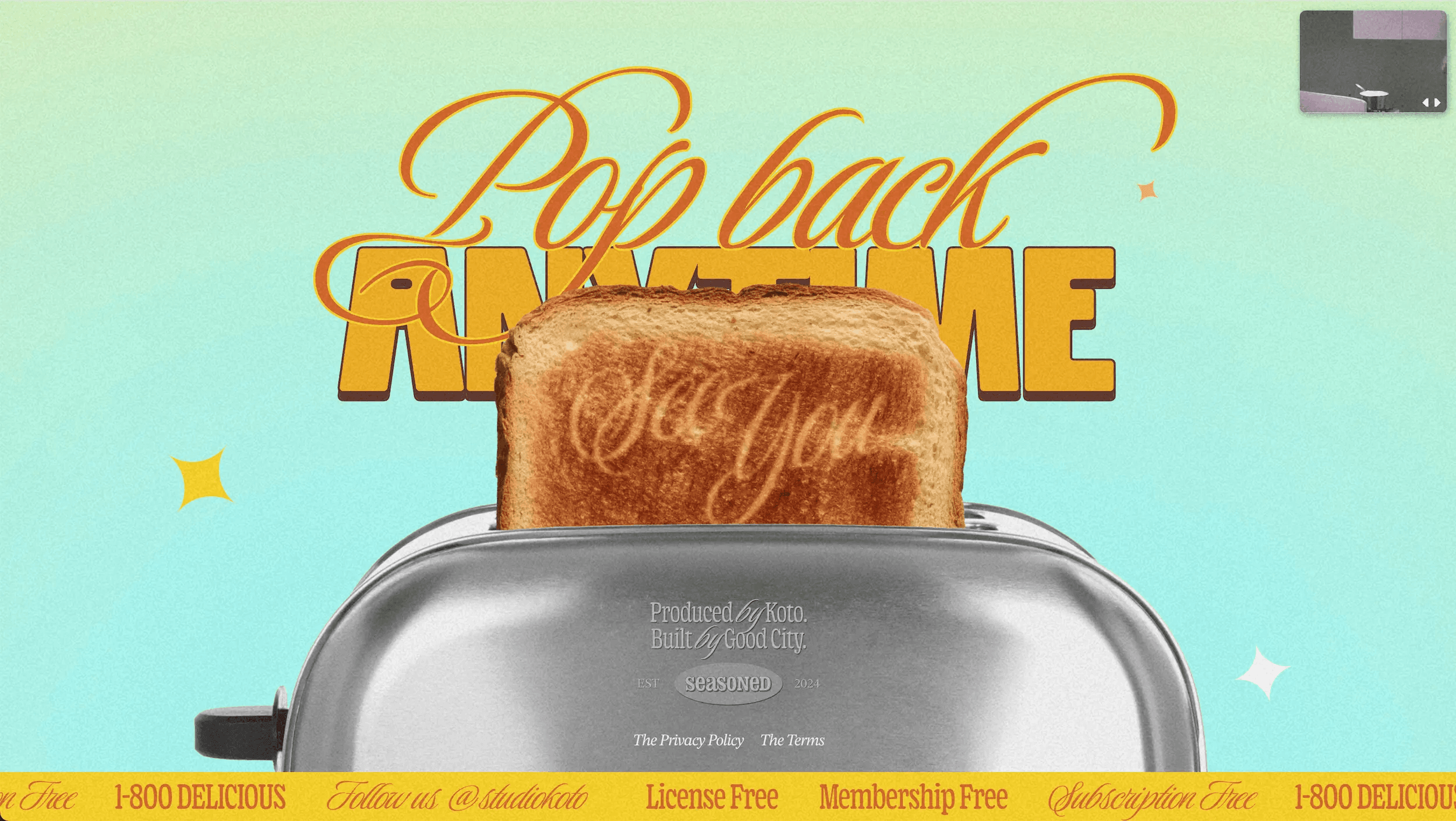
What Season Koto Studio has accomplished is taking something as potentially dry as brand strategy and transforming it into a deliciously creative experience that stands out from every other agency website. It's a perfect example of how thinking outside the box with your website design can create a memorable experience that visitors won't soon forget.
2. Stripe
Stripe's website is a fantastic example of achieving that modern and clean professional look while enhancing it with really cool illustrations and sleek animations.
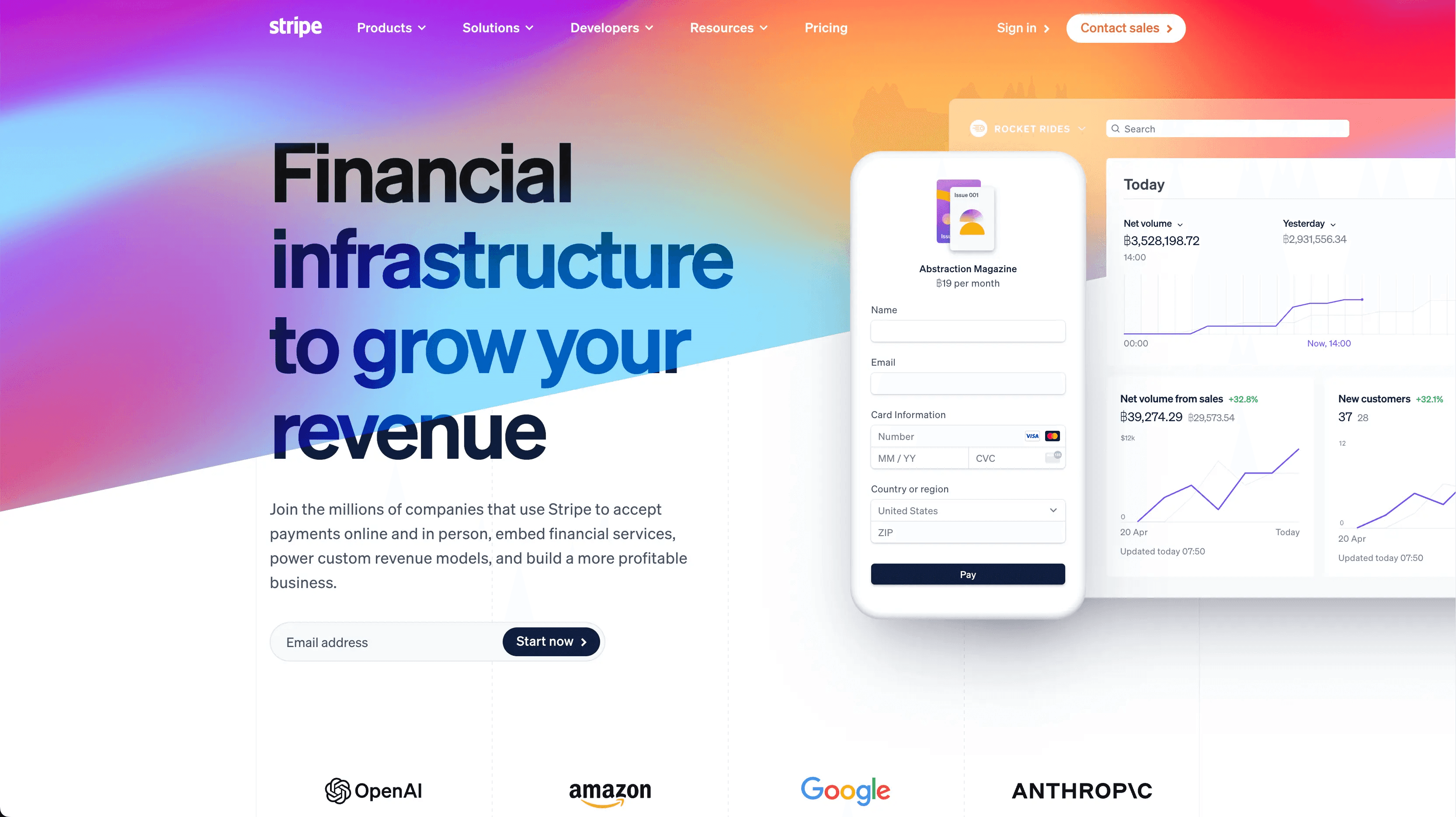
What makes their site special is how each animation directly ties to the explanatory paragraphs beside them. Making the content more impactful and engaging.
As a visual learner, I appreciate how these illustrations and animations help me understand the context much better. Call me childish, but seeing things visualized really helps concepts stick in my mind.

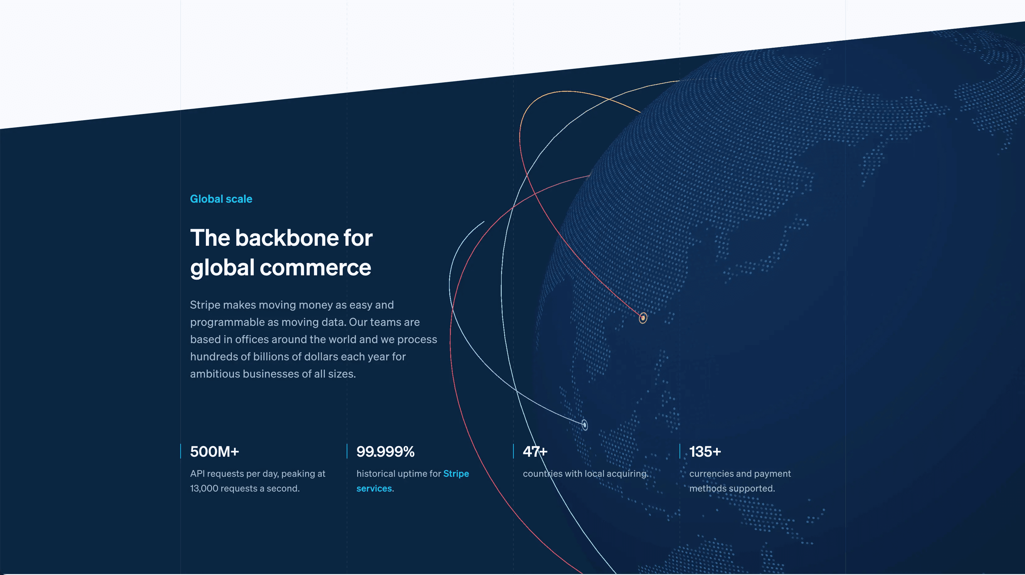
The color palette is great! It's bright and uplifting, which is refreshing for a tech/finance company. The tech industry has overused the dark theme for far too long, so it's nice to see bright colors making a comeback in web design. The vibrant colors create an inviting atmosphere that makes exploring their services feel less intimidating.
Their global scale section features animated lines circling a globe that effectively demonstrating Stripe's worldwide reach. This visual is backed by impressive statistics that further emphasize their global impact without resorting to dry text alone.
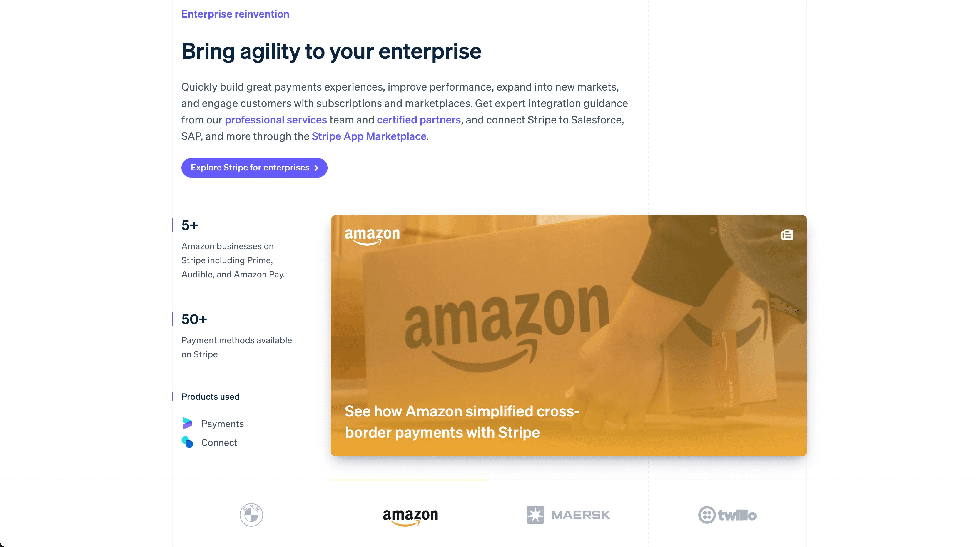
The client showcase section stands out with its unique grid-like background. When you click on different company logos, the content dynamically changes to show how that specific business uses Stripe's services. This interactive element invites engagement while showcasing their diverse client base.
Another impressive feature is their location-based personalization. I'm currently in Thailand and the site displays Thai characters and the Thai Baht currency symbol in relevant sections. This level of personalization demonstrates attention to detail and makes the experience feel tailored specifically to me.
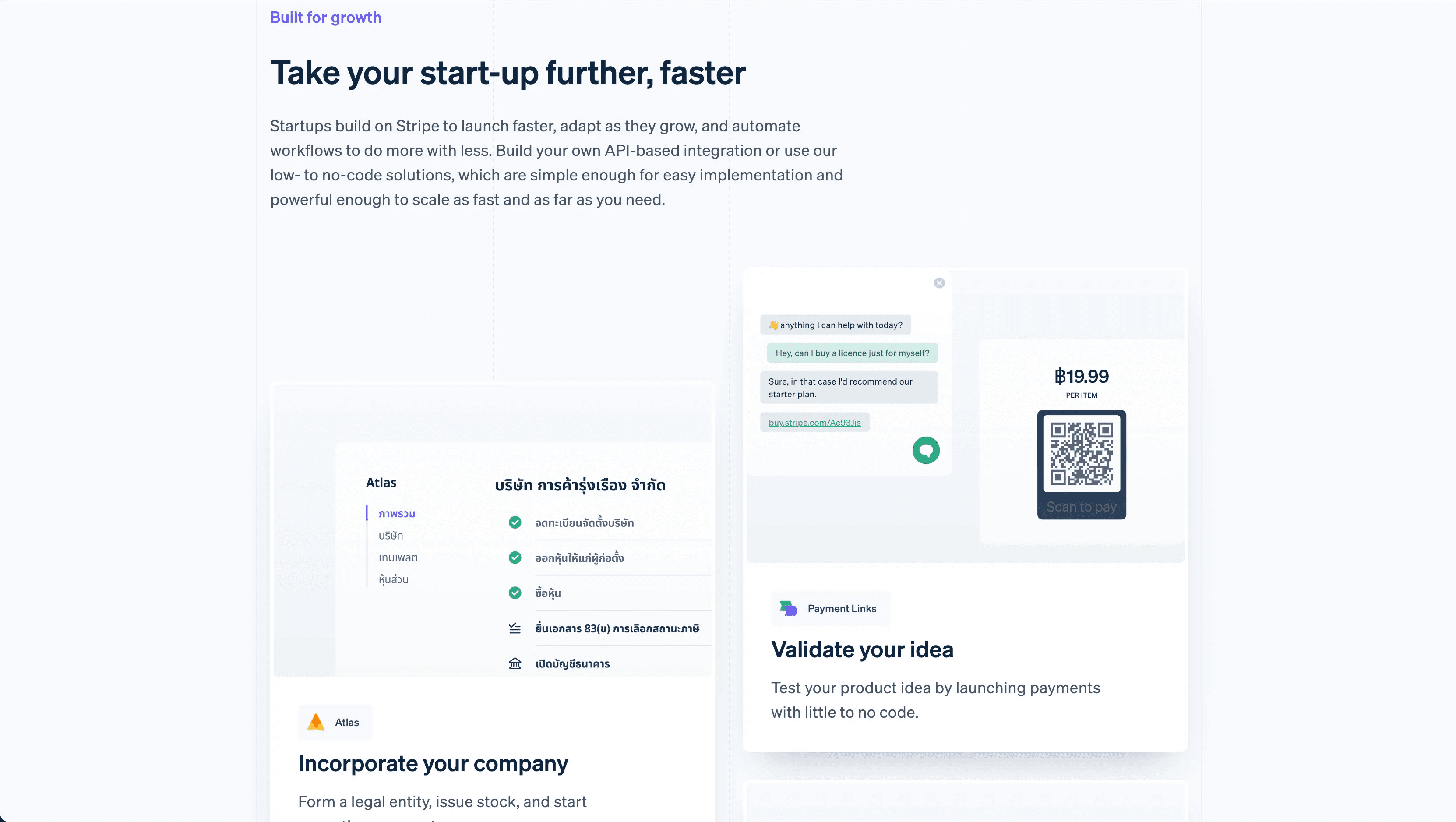
The developer section includes coding animations and custom icons that visually represent their developer tools. Instead of just describing their API capabilities, they show them in action with animated code examples.

Overall, Stripe's website succeeds by combining excellent UI/UX principles with great design elements, visuals, colors, illustrations and animations. It proves that a professional site doesn't have to be boring. It can be functional and visually engaging at the same time.
3. The Coffee Miners

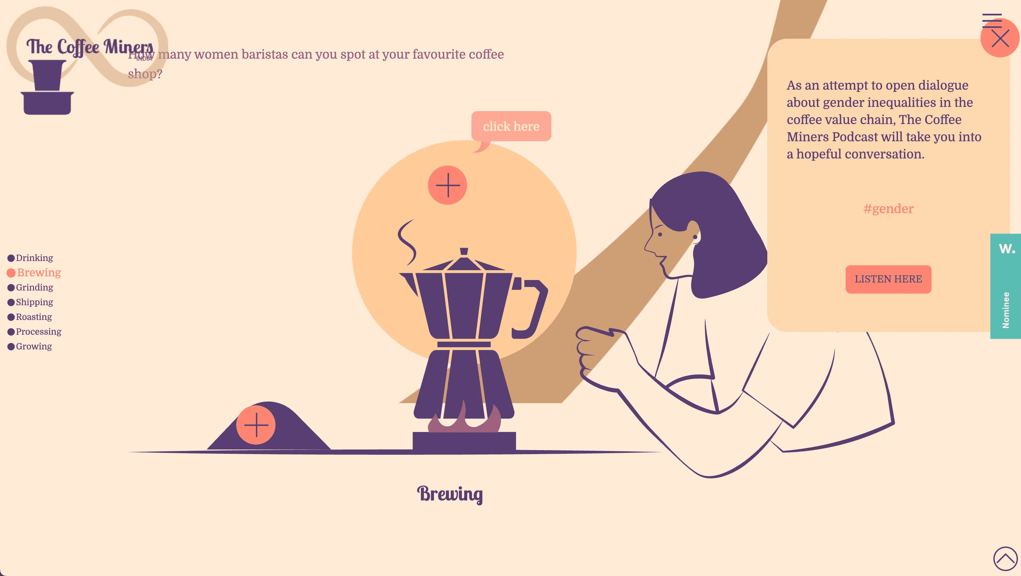
The Coffee Miners website is an absolute delight. Particularly for its creative use of 2D flat illustrations. What makes this site special is how they've transformed everyday objects like coffee mugs and plungers into characters with distinct personalities. This approach immediately creates emotional connections with visitors and makes browsing the site genuinely fun.

As you scroll down the page, you're treated to clever animations. Like a coffee mug tipping over with a spill that follows the trajectory of your scroll. This continuous illustration creates a path down the page, guiding your journey in a visually engaging way. To the left of this spill path, you'll find each of the key points they want to highlight as you navigate through the site.
The illustrations themselves use a simple color palette - nothing over-the-top or distracting. This restraint demonstrates that effective design doesn't need to be complex to be impactful. Sometimes, a few well-chosen colors can create a more memorable experience than elaborate designs.
The site also features interactive elements where clicking on illustrated items reveals more details about specific details. This playful interaction encourages exploration while still delivering the necessary information about their coffee offerings.
What's particularly interesting about The Coffee Miners' approach is their storytelling structure. Rather than starting with origins and working forward, they begin with the end result (drinking coffee), then move to brewing, and finally back to where everything originated. This reverse chronology is unexpected and refreshing. Another way they've chosen to stand out from conventional website approaches.
One of my favorite sections is how they've illustrated their team members as cute coffee-based characters rather than using standard portrait photos. This creative alternative adds personality and warmth to the team section, making the company feel approachable and human despite the illustrated format.
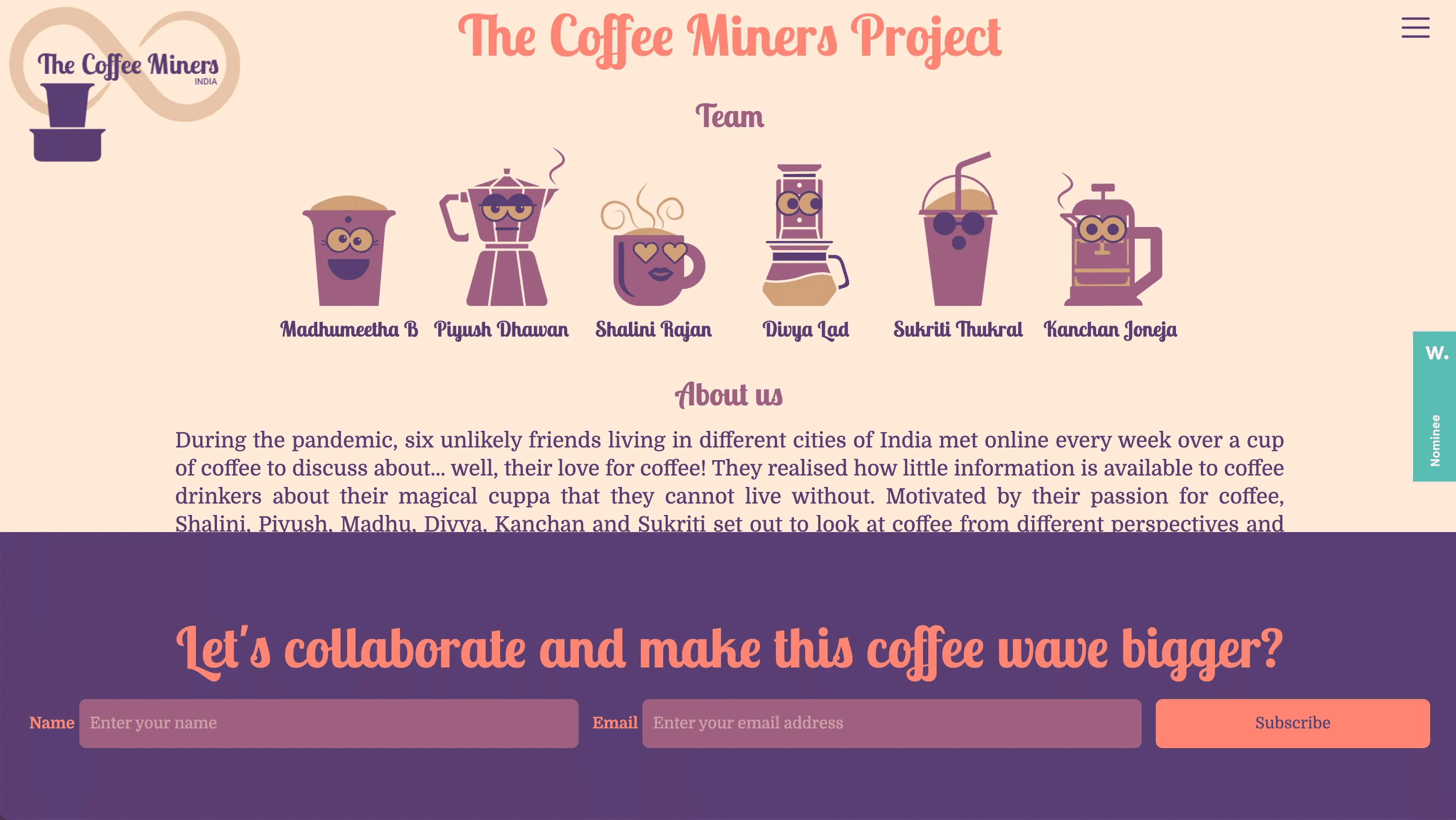
The Coffee Miners site demonstrates that e-commerce doesn't have to be boring or purely functional. By infusing personality and storytelling through illustrations, they've created a memorable brand experience that stands out in a crowded market while still effectively showcasing their products.
4. Alex Wright Psychotherapy
Alex Wright Psychotherapy's website is simply aesthetically beautiful. The use of illustrations throughout the site is absolutely stunning. It creates an immersive visual experience that perfectly complements the sensitive nature of psychotherapy services.

The illustrations feature engaging and fun colors that create an inviting atmosphere. This approach is particularly effective for a psychotherapy practice, where potential clients might feel anxious about reaching out for help.
What makes this site particularly unique is its commitment to storytelling. As you scroll through the pages, a visual narrative unfolds with text thoughtfully integrated into the illustrations. One section flows seamlessly into the next, with background images that flawlessly integrate across sections. This creates a continuous journey that mirrors the therapeutic process itself. A clever design choice that reinforces the service being offered.

The text placement is strategic rather than conventional. Instead of maintaining consistent width throughout, the designers have placed text in areas that provide the best contrast against the background illustrations. This demonstrates how breaking conventional design rules can sometimes create a more effective and visually appealing result.

While the site excels at creating an emotional connection through its visual storytelling, it does save the practical information about services and solutions for the end of the journey. This could be seen as a potential limitation from a pure UX perspective, as some visitors might want immediate access to this information. However, the immersive approach effectively communicates the empathetic nature of Alex's practice in a way that a more conventional site structure could not achieve.
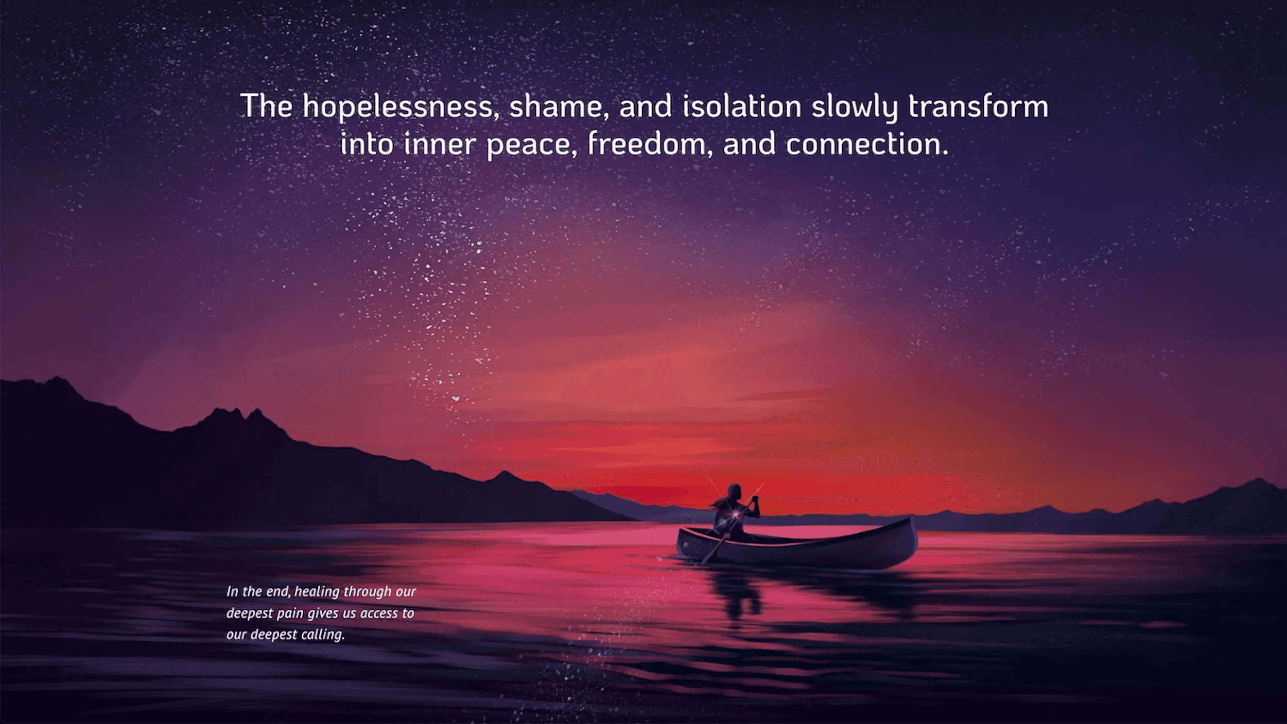
Overall, Alex Wright's psychotherapy website demonstrates how a service-based business can create a deeply engaging experience through illustration and storytelling. It stands out from the clinical and text-heavy approach often seen in therapy websites by creating an emotional connection before diving into service details. It’s definitely a refreshing and memorable approach!
5. Rive
Finally, we have Rive's website. And I'll admit I'm a bit biased because I love their product. For those who don't know, Rive is a company that enables developers and designers to create cool animations for various platforms including web, gaming, videos and so much more!
What makes their website truly stand out is their creative approach to call-to-action buttons. Let's be honest… I'm a sucker for gimmicks. Anything quirky, fun and a little bit goofy tends to win me over and Rive absolutely nails this approach.
The moment you land on their site, you're greeted with a clean and well-designed interface. But when you hover over any of their call-to-action buttons, each button features a unique, playful animation that transforms the standard user experience into something memorable.
For instance, when you hover over one button, a cat paw attempts to grab your mouse cursor, creating an unexpected moment of delight.

Another button transforms into a rocket ship with a tiny astronaut flying upward. While some might consider these animations excessive, they perfectly showcase what Rive's product can do while creating a fun, novel experience.

Their final call-to-action at the bottom of the page features a simpler animation of a hover car that moves as your cursor passes over it. This demonstrates how animation can be applied at different levels of complexity depending on the context.
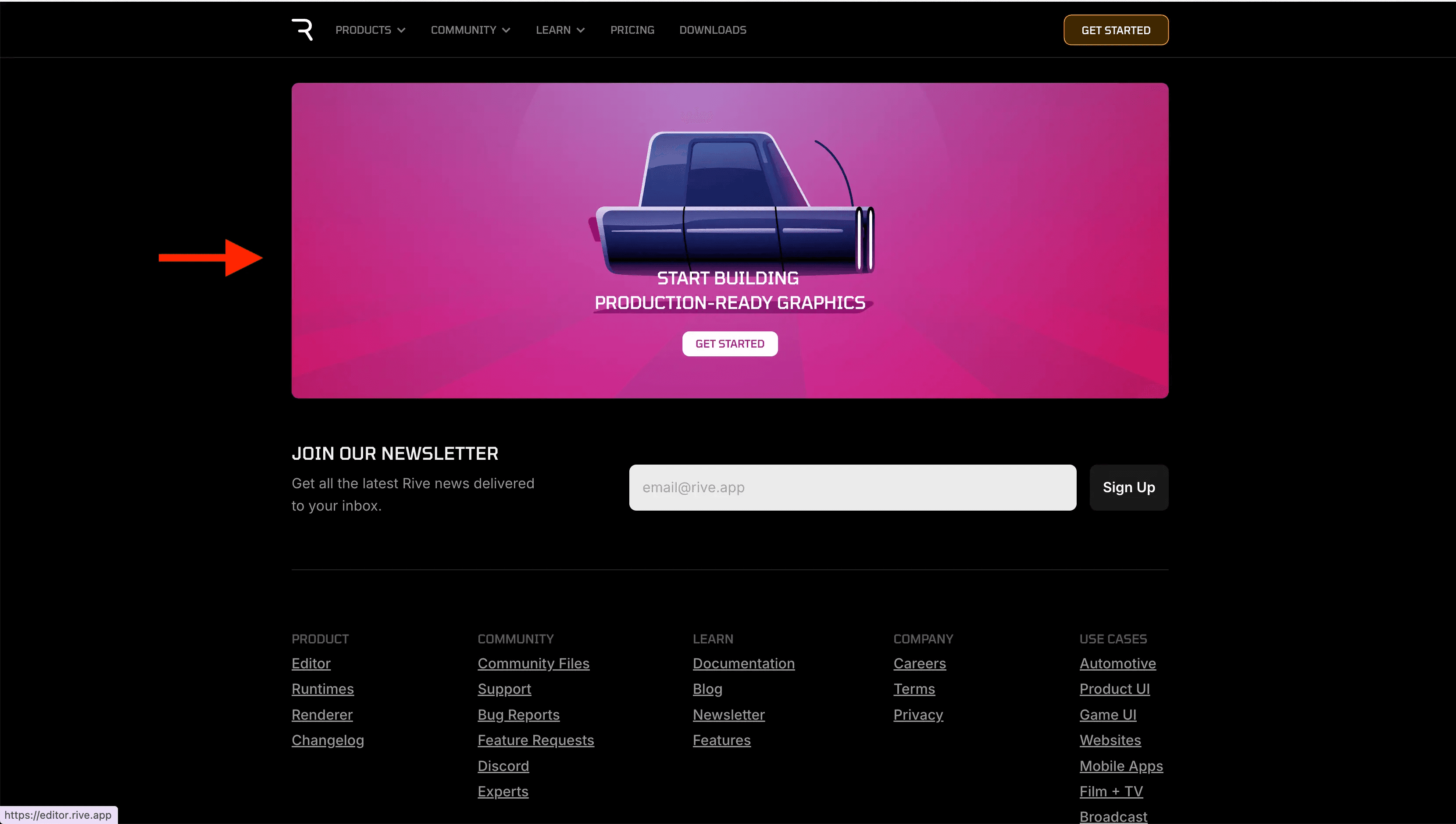
Many websites include call-to-action buttons as a necessary but uninspired element. Rive transforms these functional components into memorable moments that showcase their product capabilities while creating genuine delight. It's a brilliant example of a company using their own product to demonstrate its value in a practical application.
What's particularly effective about Rive's approach is that these animations aren't just decorative… THEY ARE STRATEGIC! By creating these moments of surprise and delight, they're increasing the likelihood that visitors will remember their brand and product. They’re also demonstrating their product's capabilities in a way that's far more effective than simply describing them would be.
Rive's website proves that even the most utilitarian elements of a website can be transformed into opportunities for creativity and brand expression. Their approach to CTA buttons elevates the entire user experience while effectively communicating what makes their product special.
Final Thoughts
These 5 websites demonstrate that it's absolutely possible to create unique and engaging web experiences without sacrificing usability. By thoughtfully incorporating illustrations, animations and creative concepts, these sites stand out from the sea of template-based designs that dominate the web today.
Whether it's Season Koto Studio's clever retro cooking theme, Stripe's seamless integration of animations with content, The Coffee Miners' charming illustrations, Alex Psychotherapy's immersive storytelling, or Rive's playful button interactions. Each site finds its own way to create a memorable experience.
In 2025, with tools that make creative web design more accessible than ever, there's no reason to settle for boring templated websites. Let these examples inspire you to think differently about how your website can engage visitors while still delivering a great user experience.
Remember, standing out doesn't mean abandoning good UX principles… It means applying them creatively to create something truly memorable!