Why Websites Fail to Attract Clients
Oct 11, 2024

Updated 11 October 2024
Do you have a website but not getting enough website visitors or are they visiting but just not converting into clients? Don’t worry because there are some things you can do to improve this.
We will cover the common mistakes people make that lead to low conversion rates for their websites. For those new to the website world, ‘conversion rates’ measure the conversion of a website’s visitors into customers.
When you read the below, you’ll see some examples of websites that are good and bad and then we’ll provide some tips on how you can turn things around and improve your website’s conversion rates.
The 8 common mistakes people do that fail to attract clients to their website are:
1. Having no or an unclear value proposition (which should be added to your ‘hero’ section)
2. No Call-to-Action
3. Bad content
4. Website is hard to navigate through
5. Lack of trust or credibility
6. Not making your website mobile-friendly
7. Slow page loading times
8. Not doing proper Search Engine Optimization (SEO)
1. Having no or an unclear value proposition (which should be added to your ‘hero’ section)
Did you know that the first impressions your website makes are super important? It can be the difference between a visitor sticking around and becoming a customer, or clicking away and never coming back. That’s why your homepage, and especially the hero section at the very top, is crucial.
And for those who don’t know what the hero section is on a website. It’s the top section of your homepage that immediately shows up on the screen. It’s called a “hero” section because it can truly be the hero of your entire website and is where your first impressions are made.
You’ve got about 5 seconds to grab a visitor’s attention, so it’s essential that you make the most of that time. Unfortunately, many businesses make mistakes with their hero section, especially around the text which should be your value proposition to your potential customers.
People might use technical language that’s hard to understand or even make it all about themselves instead of focusing on the visitor’s problem. Or in other extreme examples, miss the opportunity and not include anything in their hero section.
There are ways to avoid these mistakes! You need to create a results-based heading that highlights the benefit to the user and makes it clear why your website is better than your competitors. Your value proposition needs to be crystal clear and focus on solving the visitor’s problem. Remember: “be clear over being clever!”.
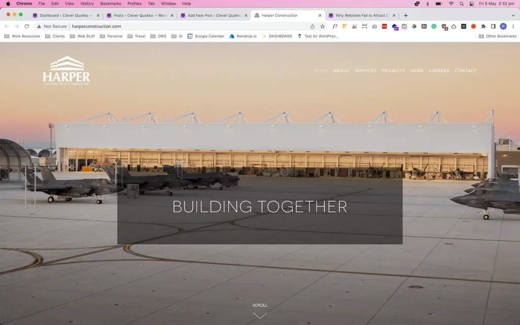
❌ Don’t Do (Harper Construction)
The company has just put a generic statement of ‘building together’. It doesn’t really provide the user with insight into what value the company actually provides. The other issue is that their hero image doesn’t paint a good picture of what the company does. Yes from the name is obvious that Harper Construction is a construction company. It’s not until you scroll down to the next section that you discover what value they can actually provide.
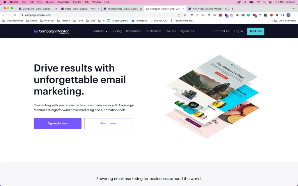
✅ Do (Campaign Monitor)
The main heading grabs your attention with its direct message of “Drive results with unforgettable email marketing”, but this website also does it very well to explain how they do this by saying “Connecting with your audience has never been easier with Campaign Monitor’s straightforward email marketing and automation tools.”. For me, it’s very clear and showcases what value they can provide to customers.
You can probably see a massive difference in the impact it will make for a user if you compare the two. In the first example, they are left in a bit of a mystery but in the 2nd example, it’s clear as to what the company offers once you land on the homepage.
2. No Call-to-Action
For websites to convert, you need to have a strong call to action, with only one clear option which is typically done with a button to a booking or contact form, a sign-up form or something that generally gets the users to get in touch with you.
The call to action should be assertive, not passive, with clear instructions such as “get a free consultation” or “speak with an expert.” If a website does not have clear and effective calls-to-action, visitors may not know what action to take and may leave without converting.

❌ Don’t Do (Property Buy USA)
This website has a very slow animated message saying to call them, which on its almost a call to action. But the issue is: (1) this message takes forever to animate across and (2) there’s no actual immediate link or button for the users to contact the company. In fact, it’s not until you scroll all the way to the bottom that you see in very tiny font the contact us link.

✅ Do (Trello)
This company does a fantastic job of using the call to action function. The business is a subscription-based organization and you see that they have 2 very strong and assertive CTAs. The top right states “Get Trello for Free” because they know that people love receiving things for free. It also has an immediate sign-up form right within the hero section. They made it very easy for the user to try out their services. This is a great example of a strong use of CTAs.
3. Bad content
The third mistake is having bad content. Now I’m talking about websites that have too much information that overwhelms the user, poorly written content or content that is not relevant to the target audience.
All these can cause visitors to lose interest quickly. You need to ensure that the information you put on your website is clear, concise, and to the point and importantly addresses your target client’s problems or needs.

❌ Don’t Do: Roadside America
Our initial thought is that it’s super overwhelming and really don’t know where to start in terms of navigating through the site.
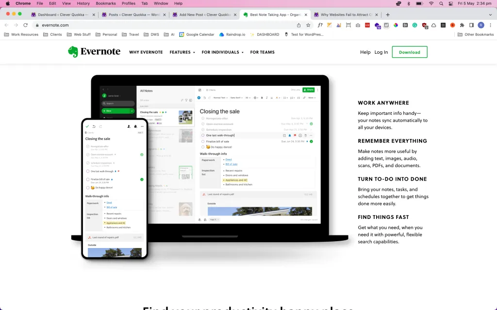
✅ Do (Evernote)
This website hits all the main points in their 2nd section right and then as you scroll down, they’ve very cleverly covered all the pain points that customers want to address in very concise bite-sized paragraphs.
4. Website is hard to navigate through
Users can easily get frustrated if it’s hard to go through your site. People these days can be pretty impatient, so if they can get to where they want to go easily, they’ll probably leave your website.
Your website design should be easy to use with a clear navigation menu.

❌ Don’t Do (Connection)
If you use the dropdown, you get hit with a lot of options within the navigation. They do offer a lot of products and services, but just setting out everything in this fashion can make it hard for users to navigate because a user is spending a lot of time going through each of the options searching for what they’re looking for.

✅ Do (Apple)
In our view, Apple is the leader in terms of best practices for websites. We all know that Apple has a lot of products on offer so trying to structure a website to include everything is a bit of a challenge. From the navigation, they’ve done a great job in grouping all of their products into categories, and then each dropdown shows the information in terms of importance. Then as you scroll down, they don’t overwhelm the users with too much information but instead, they just include great imagery of the products in terms of importance and they help the user navigate to the specific product page.
5. Lack of trust or credibility
Now we all do it! If we’re looking to buy something online or go to a restaurant, we usually turn to other people’s opinions first. People generally rely on word of mouth or feedback from other customers before committing to a purchase.
You can easily build trust or credibility by including testimonials on your site. Business owners usually fail to put these testimonials or reviews on their website or even worst, don’t even bother getting testimonials from customers.
This is otherwise known as using “social proof”, such as testimonials or logos of well-known clients, to build credibility. If a website does not inspire trust, visitors may be hesitant to provide personal information or make a purchase.

✅ Do (Slack)
Great use of client logos (and not to mention some big names as well), right at the top after the hero section. When you see these big names, you immediately feel “Oh, well if these big companies are using their products, they must be good“.
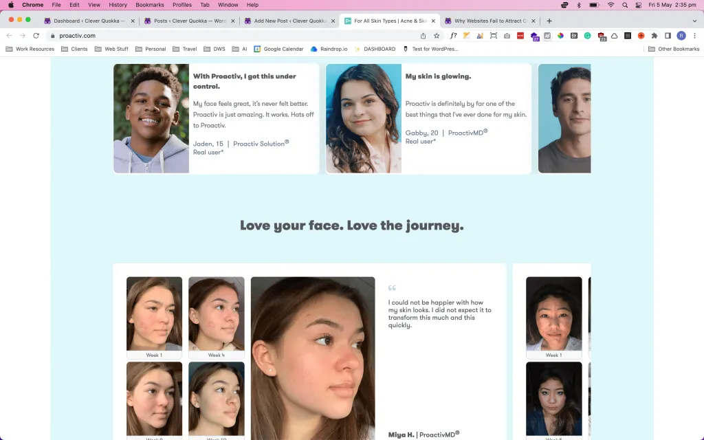
✅ Do (ProActiv)
Another example is personal testimonials. And Proactiv does a great job at this, they provide testimonials with the photos of their clients. If you’re providing a product and want to take social proof to the next level, showing these before and after results are a great way to earn a person’s trust.
6. Not making your website mobile-friendly
Latest statistics show that almost 60% of internet users view websites on their mobile phones. With more people using mobile devices to access the internet, a website that is not optimized for mobile can miss out on potential customers.
A lot of people build a website but don’t even check if it looks good on mobile. So to avoid this, make sure when you build a website that it looks good on mobile too. This will mean that text or images are not to be too big or small on mobile.
A lot of website page builders offer responsive edit modes, so this allows you to update the styling of a website on desktop, tablet and mobile views.
Making a website mobile-friendly can get a bit technical, so if this is totally out of your comfort zone and you don’t have the time or patience to do this, then a website specialist can definitely help you with this.
7. Slow page loading times
Websites that take too long to load can frustrate visitors and cause them to leave the site. As we mentioned before, you need to get the attention of users within the first 5 seconds and if your site takes longer than these 5 seconds, they will leave.
This also goes for websites that take forever to load. For WordPress, there are a lot of plugins that help make your website faster. Plugins like WP Rocket or Autoptimize can help reduce slow loading times.
Now this does get a bit technical, so if you don’t have in-depth knowledge of building websites, you need to read up on this and invest in website optimization tools or get a website professional to help out with this.
8. Not doing proper Search Engine Optimization (SEO)
This last point also gets technical too! You need to optimize your website for SEO. It improves your website’s visibility on search results and makes it easier for potential customers to find.
This includes making sure your website loads pretty fast, doing keyword research, and also creating back-links. If you have the time to invest in SEO research, there are free courses out there that can help. We suggest checking out SEMrush Academy as a starting point.
Again, if you don’t know much about SEO, you may need to research it more or hire an SEO specialist or a website specialist who also offers SEO services to help you out with this.
Key Takeaways / Action Items:
Have a clear and compelling headline in your hero section that immediately explains what your business does in simple language that can also set your website apart from your competitors.
Use a strong and assertive call-to-actions with clear instructions to guide users to take action.
Keep content relevant, concise, and interesting to prevent visitors from losing interest quickly.
Use an easy-to-use and visually appealing design with clear navigation to enhance user experience.
Build credibility by using social proof like testimonials and logos of well-known clients.
Make sure your website is mobile-friendly to reach potential customers who use mobile devices to access the internet.
Improve your website page loading speed to avoid frustrating visitors and losing potential customers. This can be done with optimization plugins or by hiring a website specialist.
Optimize your website for search engines to improve its visibility and make it easier for potential customers to find. An SEO specialist or website specialist that does SEO can assist with this.