Using Call to Action Buttons On Your Website The Right Way!
Nov 1, 2024
The power of a simple button on your website might surprise you. Call to Action (CTA or CTAs) buttons can make or break your website's success. In fact, research shows that well-designed CTAs can boost conversion rates by up to 70%. Let's dive into how to make your CTAs work harder for your business.
What's a CTA?
Think of a CTA as your website's friendly store assistant. It's a button or link that guides your visitors to take the next step - whether that's booking a call, signing up for your newsletter, or buying your product.
Picture this: You walk into a store looking to buy something. The helpful staff member says, "The items you're looking for are right this way!" That's exactly what a CTA does on your website. It points your visitors in the right direction and tells them exactly what to do next.
Common examples of CTAs include:
"Book a Call"
"Start Free Trial"
"Get Started"
"Sign Up Now"
"Download Guide"
"Join Newsletter"
Good CTAs are like clear road signs on your website's journey - they help your visitors get exactly where they want to go, without any confusion or wrong turns.
Remember, a website without CTAs is like a store without a checkout counter. You might have amazing products or services, but if people don't know how to get them, they'll probably leave empty-handed.
Now, let’s go through some tips on how you can effectively use CTAs on your website.
1. The Clarity Challenge: Speaking Your Visitor's Language
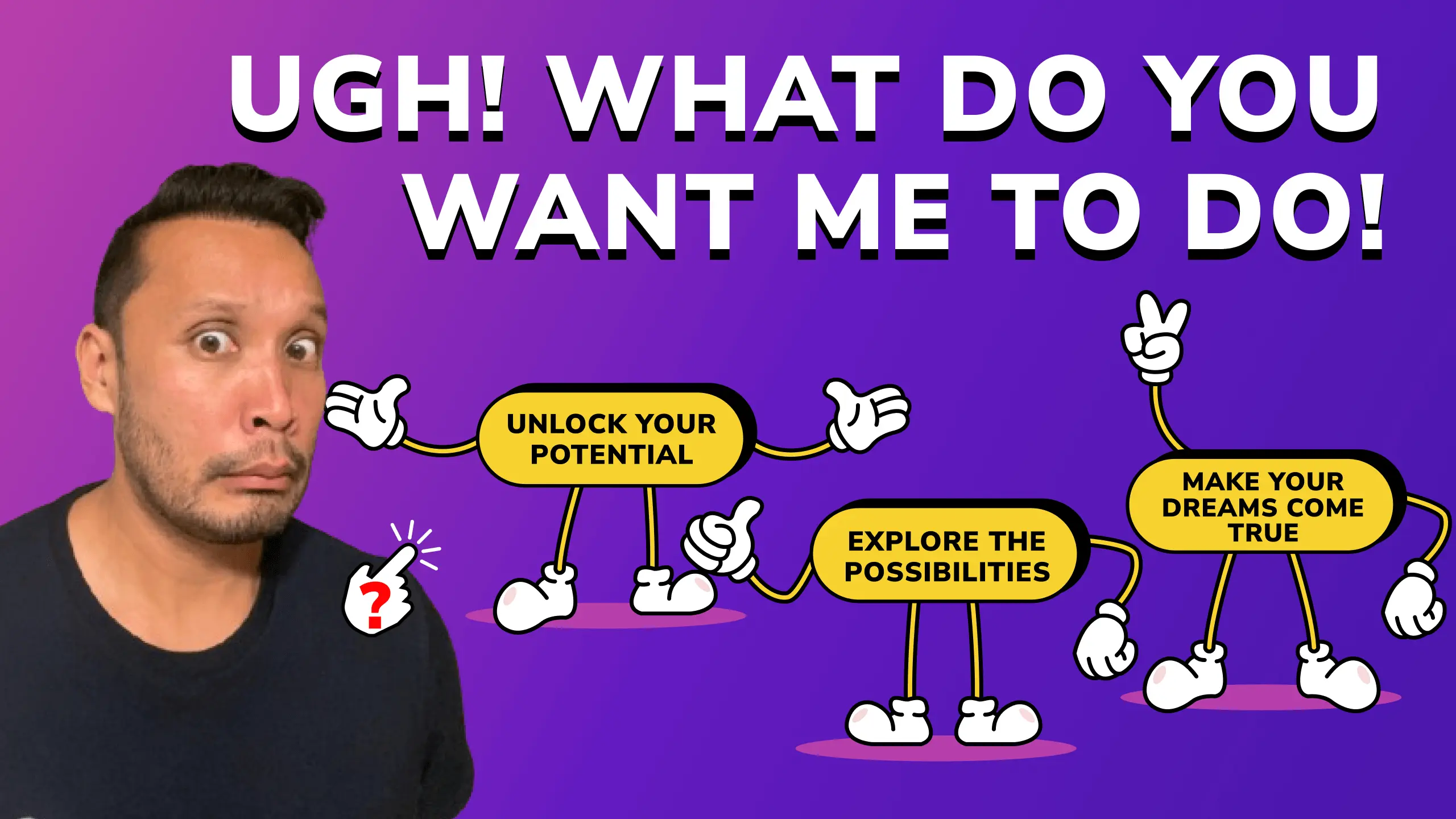
Many websites use vague or flowery language in their CTAs. "Explore the possibilities" might sound poetic, but it doesn't tell visitors what will happen when they click.
How to overcome it:
Use direct, action-oriented language
Be specific about what happens next
Focus on value for the visitor
Keep button text short and clear
2. The Placement Puzzle: Where CTAs Should Live
Even the best-written CTAs won't work if visitors can't find it. Strategic placement makes all the difference between a click and a bounce.
How to overcome it:
Put primary CTAs above the fold within your hero section (ie, within the top section of any web page)
Include CTAs in your navigation menu
Add buttons at natural stopping points
Test different positions to find what works
3. The Content Connection: Making CTAs Work With Your Message
Your CTA needs to feel like a natural next step from the content that comes before it. Random buttons asking for action without context rarely convert well.
How to overcome it:
Match CTA language to surrounding content
Build up to your CTA with compelling copy
Create a logical flow toward taking action
Use different CTAs for different content types
4. The Mobile Mistake: Forgetting Small Screens
With more people browsing on phones than ever, mobile-friendly CTAs are crucial. Yet many websites still struggle with tiny, hard-to-tap buttons on mobile devices.
How to overcome it:
Make buttons large enough to tap easily
Leave plenty of white space around CTAs
Test your buttons on various devices
Ensure text remains readable on small screens
5. Strategies for CTA Success
Let’s recap what you can do next to effectively use CTAs on your website:
1. Strategic Placement
Place your CTAs where they'll have the most impact:
Hero section (prime real estate)
Sticky navigation (always visible)
End of content sections
Within blog posts
After client testimonials
Near pricing information
2. Clear Communication
Your CTA text should:
State exactly what happens next
Use action verbs
Focus on benefits
Create urgency when appropriate
Match your brand voice
3. Design for Success
Make your CTAs stand out:
Use contrasting colors
Add white space around buttons
Keep designs consistent
Make size proportional to importance
Include hover effects for engagement
4. Content Integration
Integrate CTAs naturally by:
Building up to them with relevant content
Using different CTAs for different pages
Testing various placements
Monitoring which CTAs perform best
6. The Power of Testing
No matter how well you plan your CTAs, testing is crucial. Here's what to test:
Button colors and shapes
Text variations
Placement options
Mobile responsiveness
Loading speed
7. Common CTA Mistakes to Avoid
Too Many Options: Multiple CTAs competing for attention can paralyze visitors. Focus on one primary action per section.
Vague Language: Avoid unclear phrases. Be specific about what happens when someone clicks.
Poor Contrast: CTAs that blend into the background won't get clicked. Make them stand out visually.
Broken Promises: Your CTA should deliver exactly what it promises. Don't mislead visitors about what happens next.
8. Moving Forward: Your CTA Action Plan
1. Audit Your Current CTAs
Check all existing buttons
Note their placement and performance
Identify areas for improvement
Test mobile functionality
2. Implement Changes
Update button text for clarity
Adjust placements for better flow
Improve mobile experience
Add CTAs where they're missing
3. Monitor and Adjust
Track click-through rates
Test different variations
Gather user feedback
Make continuous improvements
Final Thoughts
Effective CTAs can transform your website from a simple information source into a powerful conversion tool. By focusing on clarity, placement and user experience, you can create CTAs that genuinely help visitors take the next step with your business.
Remember, great CTAs aren't about forcing actions - they're about making it easy for interested visitors to engage with your business. Start implementing these changes today and watch your conversion rates grow!


